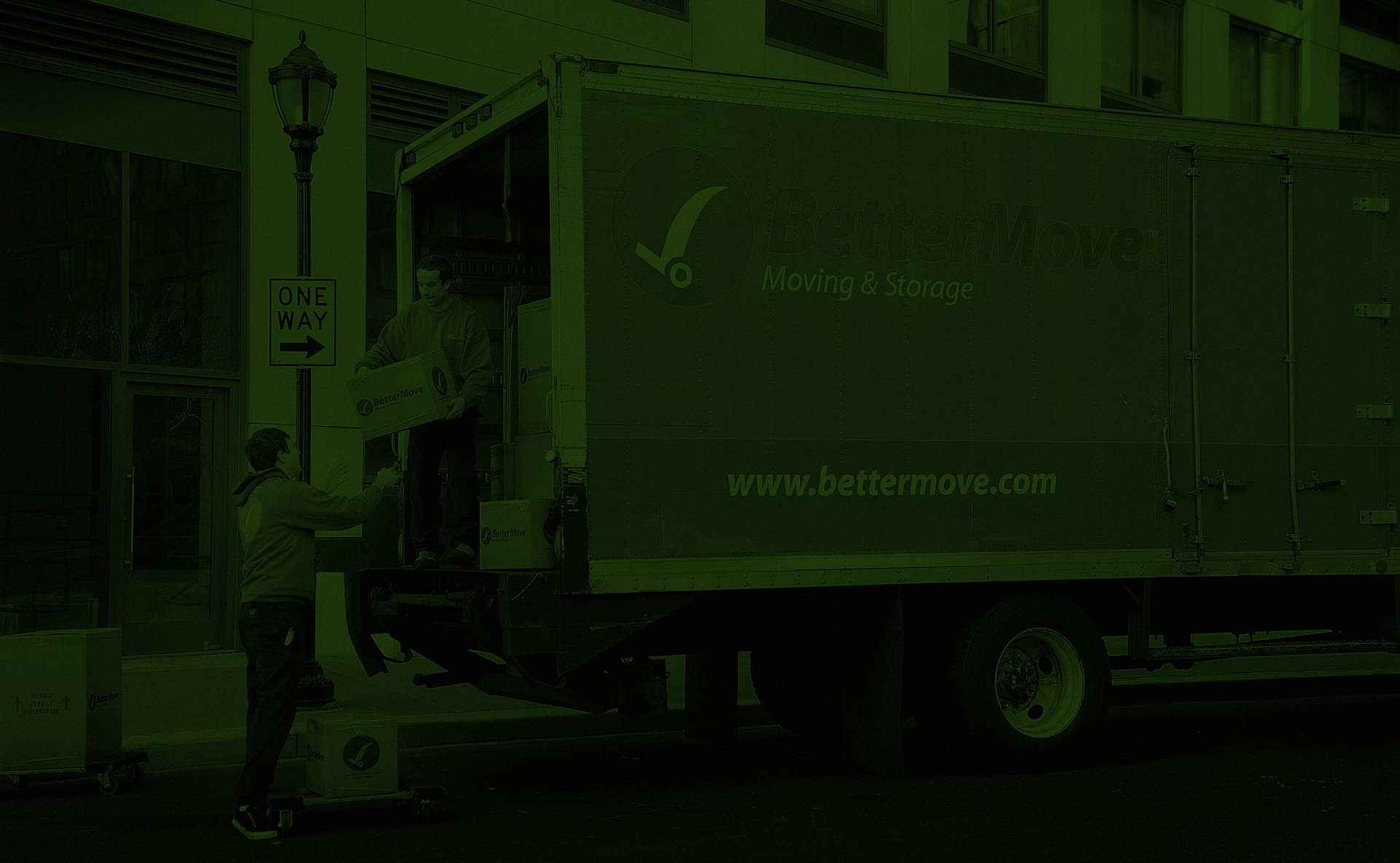
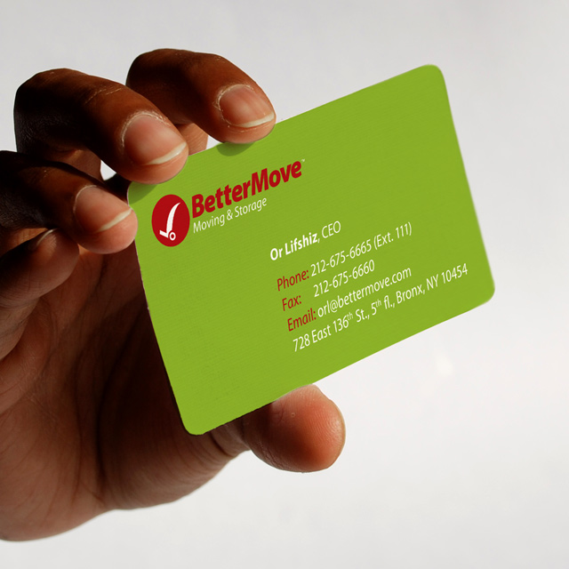
BetterMove - NYC Moving company
BetterMove – Moving Company
A N.Y.C. moving company. After writing the brand strategy two insights came up:
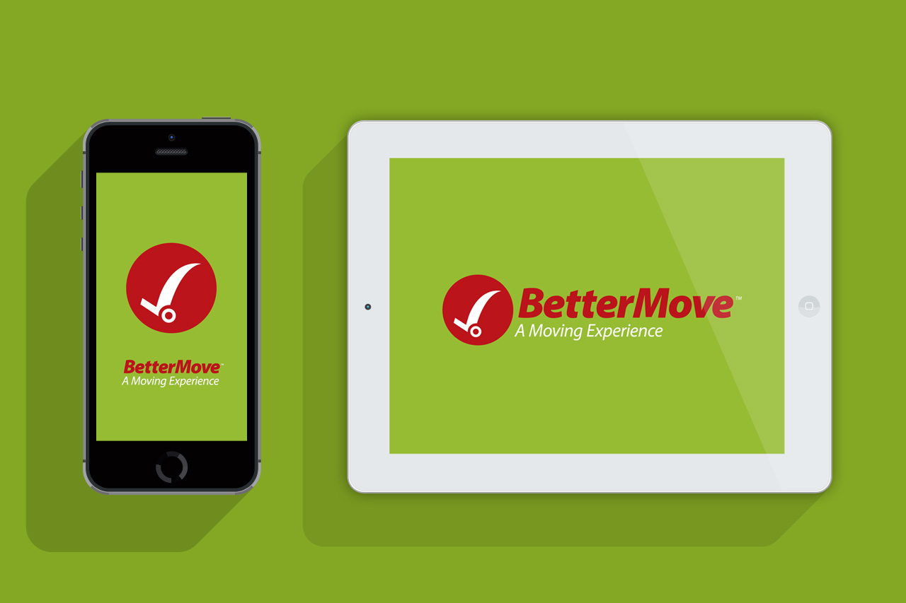
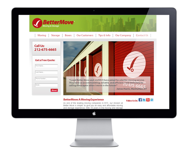
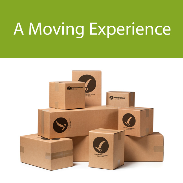
First: moving an apartment is much more than moving boxes from A to B, its actually moving memories and feelings. The slogan we created for them is “A moving experience”.
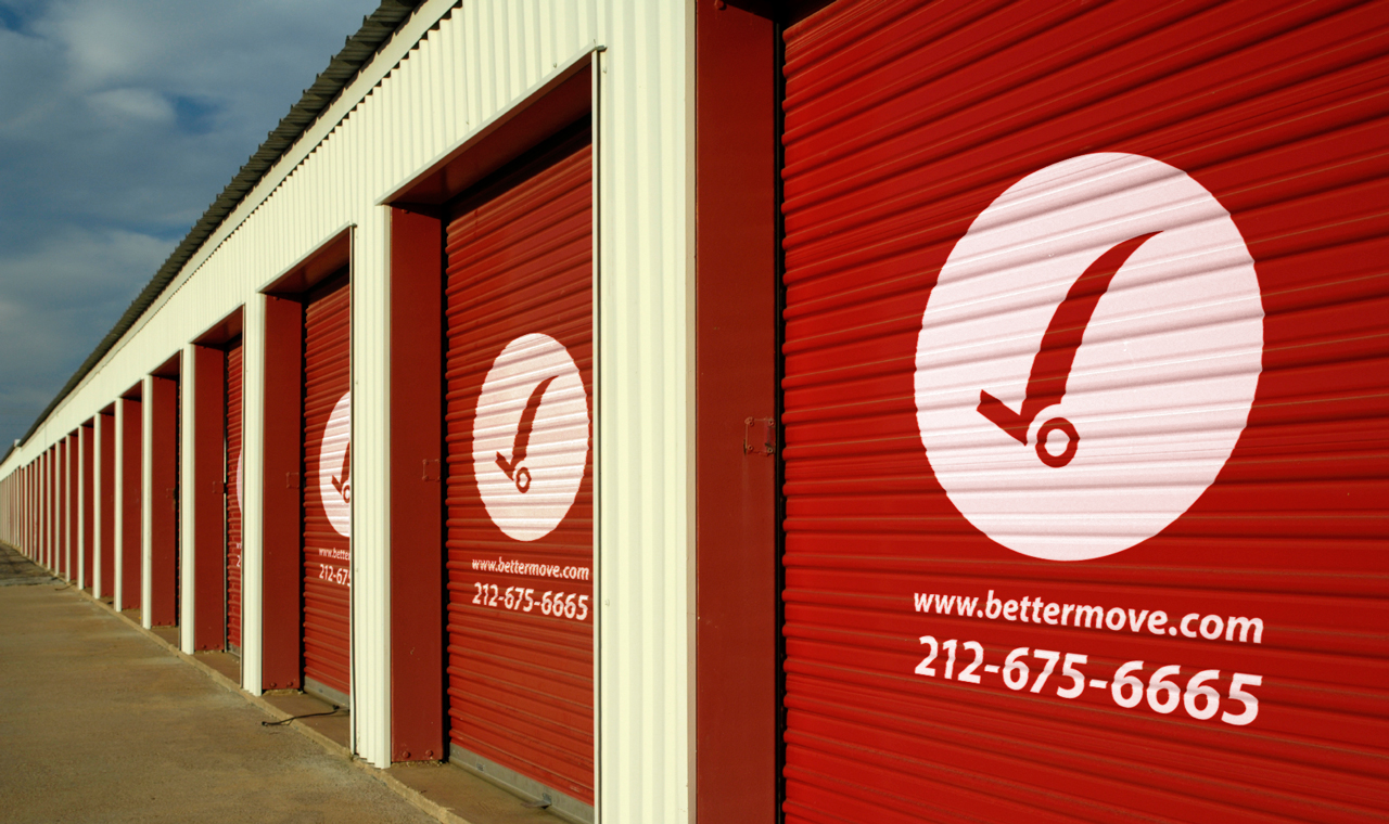
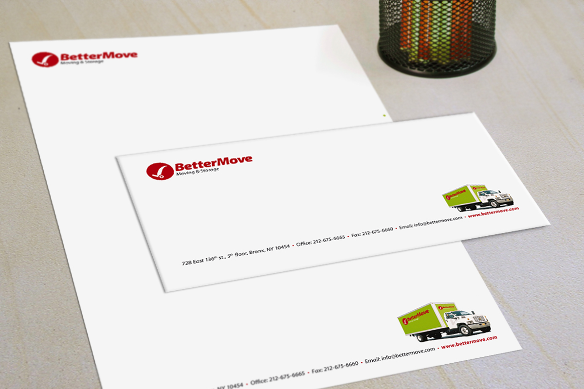
Second: the clients are looking for someone who will give them peace of mind during the exhausting move, this lead us to the logic behind the logo of the v- that came from a to do list that we mark off with a v + a moving cart.
Simple, memorable, accurate…
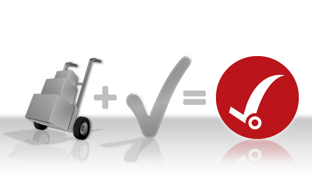
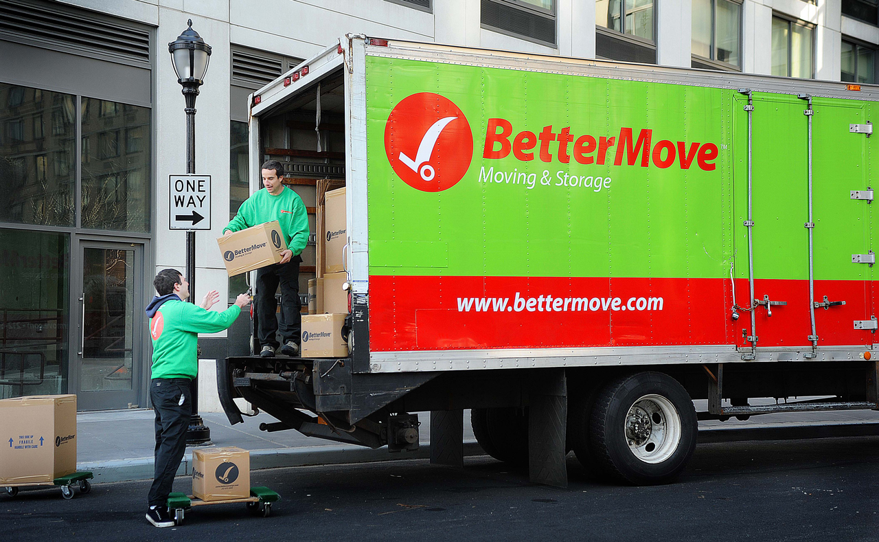
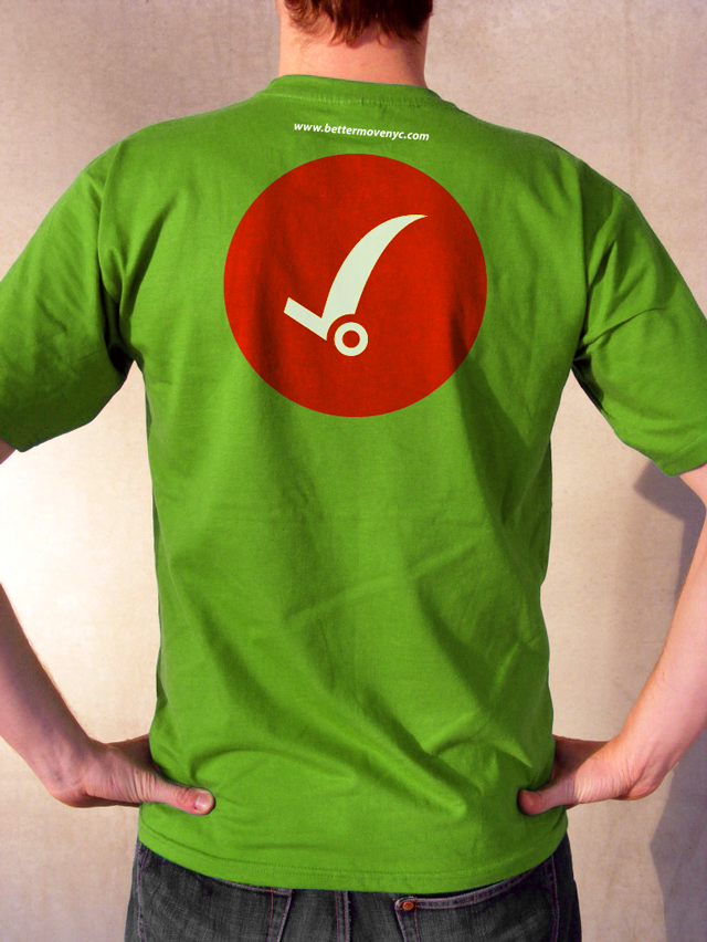
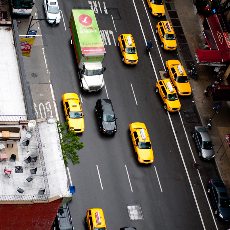
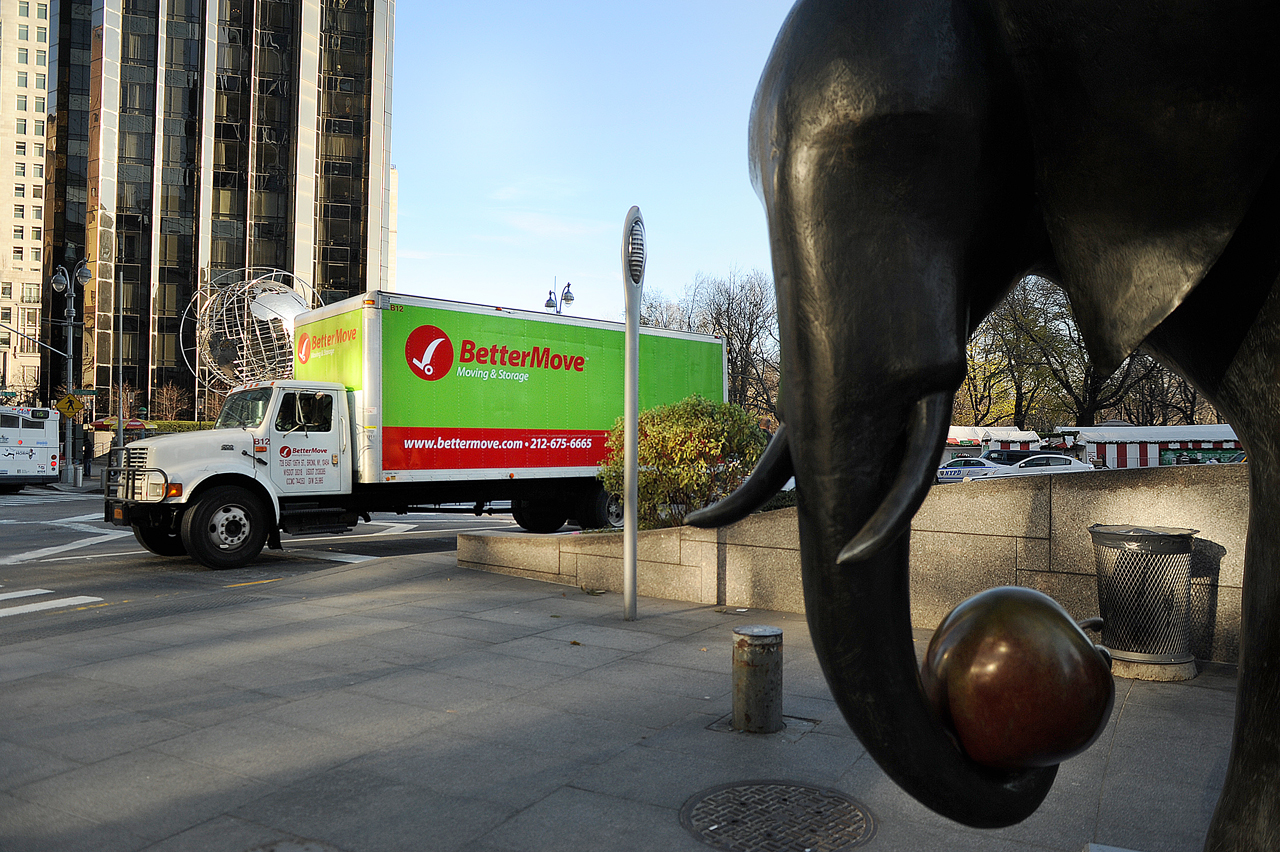
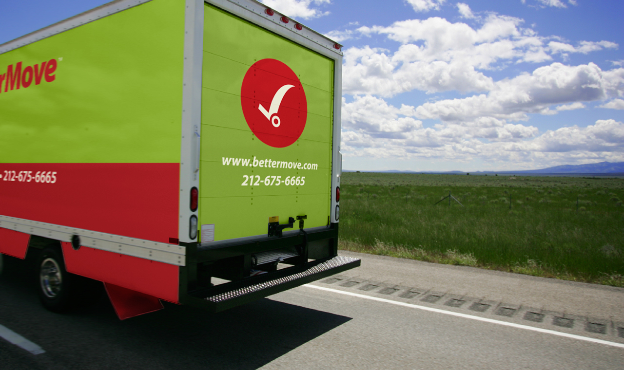
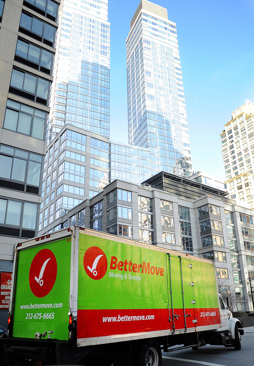
we deliberately chose the color red (which is the color of the star players in the NY moving field: Flat and Moshe’s) as one of the brand colors to show we are not going to stand on the side lines, we are going to take a bite out of the big apple :)
The guys from better move found us online, we never met face to face, and all the work was done via skype and e-mails. We showed them one high end draft, other then color adjustments they took the whole branding package exactly the way we offered it. Such a pleasure to work with clients that let you do all the work.